|
I love the tidyverse. Its dynamic functionality, coupled with an intuitive nature make it a no brainer to me for data wrangling and creating clean, high-quality figures for publication. I often find myself astounded at how plots (using the package ggplot2) can look so aesthetically pleasing with less than 10 lines of code, especially when coupled with ggplot2 extensions. I often do want to add information to my figures to help my audience digest information without much extra effort, and ggpubr does a great job at this. One thing I have found missing from ggplot functionality (in a relatively simple way), however, is the ability to add letters denoting significant differences among groups (i.e. Tukey's HSD connecting letters report) to plots created using ggplot2. So, from a bit of online sleuthing and a some trial and error, here is a semi-automated way to add connecting letters to your ggplot2 box plots.
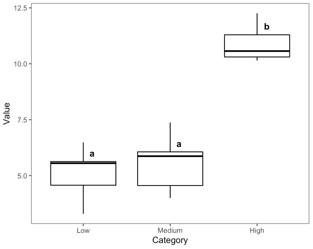
Let's start by loading useful packages: library("tidyverse") library("egg") #The egg package contains one of my favorite themes, theme_article. library("multcompView") #multcompView makes this possible. Now, let's create a dataset containing three categories (Low, Medium, High) with corresponding values (N = 10 per category) with means of 5, 5.5, and 10 and a standard deviation of 1. dat <- data.frame("Category" = c(rep("Low", 10), rep("Medium", 10), rep("High", 10)), "Value" = c(rnorm(10, 5), rnorm(10, 5.5), rnorm(10, 10))) We can see there are differences among the mean "Value" across each "Category". It is difficult to determine if the means among all groups are different from this alone. summary(aov(Value ~ Category, data = dat)) We can test for differences among groups using Tukey's Honestly Significant Difference test. When we combine this with multcompView, we can also create a connecting letters report. The following code accomplishes both and assigns the connecting letters to a data frame, "letters.df". letters.df <- data.frame(multcompLetters(TukeyHSD(aov(Value ~ Category, data = dat))$Category[,4])$Letters) I like to clean my data.frame here. colnames(letters.df)[1] <- "Letter" #Reassign column name letters.df$Category <- rownames(letters.df) #Create column based on rownames Now, let's create a data frame that will contain the information for where to place the letters within the plot. You can fine-tune the placement with hjust and vjust, but this will get you dynamic placement that corresponds to the values of each group. placement <- dat %>% #We want to create a dataframe to assign the letter position. group_by(Category) %>% summarise(quantile(Value)[4]) Rename the placement category to something reasonable and join the placement data frame with the connecting letters data frame. colnames(placement)[2] <- "Placement.Value" letters.df <- left_join(letters.df, placement) #Merge dataframes Now that we have created the data frames containing the connecting letters and the placement location (using quantile), we can call ggplot and add the connecting letters using "geom_text()". One other thing to note here is I like using "reorder()" in this case when calling the x-variable as there is no need to hard-code a reordering of factors prior to plotting. dat %>% #Dataframe from which data will be drawn ggplot(aes(x = reorder(Category, Value, median), y = Value)) + #Instead of hard-coding a factor reorder, you can call it within the plotting function geom_boxplot(color = "black", alpha = 0) + #I like to set the color of boxplots to black with the alpha at 0 (fully transparent). I also like geom_jitter() but do not use it here for simplicity. theme_article() + #Clean, minimal theme courtesy of the "egg" package xlab("Category") + geom_text(data = letters.df, aes(x = Category, y = Placement.Value, label = Letter), size = 4, color = "black", hjust = -1.25, vjust = -0.8, fontface = "bold") Here is the resulting plot. You can adjust fonts, etc. to your personal taste. Hopefully this was helpful, and thanks for reading! Feel free to comment (click comment link at header) or email me directly if you have any questions/comments/feedback.
5 Comments
|
ArchivesCategories |

 RSS Feed